Switching CRM? How to Know When to Leave
Struggling with outdated CRM software? Discover the 7 signs it's time for you to consider switching CRMs.
Sales
8 min read
Editor's Picks


Marketing
Syncing Success: The Power of Marketing and Sales Alignment
Learn why marketing and sales alignment is crucial if you want to successfully compete in your industry. No matter the industry.
Marketing
6 min read


Fuel Growth Podcast
Join us as we interview CEOs, CMOs, entrepreneurs, and seasoned executives to explore what it takes to propel your business into growth.
Sales
Switching CRM? How to Know When to Leave
Struggling with outdated CRM software? Discover the 7 signs it's time for you to consider switching CRMs.
Sales
8 min read

Guide
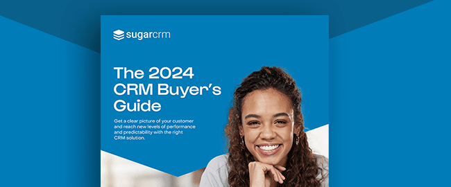
2024 CRM Buyer's Guide
Learn how choosing the right CRM can lead sales leadership to create greater visibility.
Customer Service & CX
Improving Product Quality and Customer Satisfaction with CRM Feedback Loops
How can you improve product quality with CRM feedback loops and what to be mindful of the best practices in the process? Read out blog post!
Customer Service & CX
5 min read
Using Technology to Unify Sales, Marketing, and Service for Consistent Customer Insights
Customer Service & CX
7 min read
CRM 2.0: Leveraging Generative AI for Personalized Customer Experiences
Customer Service & CX
4 min read
The latest
Super General: Key Insights on How to Embrace Change and Find Success with SugarCRM
Customer Story
5 min read
X
Sign up for the newsletter.
We're committed to your privacy. SugarCRM uses the information you provide to us to contact you about our relevant content, products, and services. You may unsubscribe from these communications at any time. For more information, check out our privacy policy.


